Matter Development | Branding

BRANDING · REAL ESTATE DEVELOPMENT

Matter Development

A corporate identity with the robustness of construction and the non-conformity of visionary people

01 The brief

An identity built on the meaning of matter.

Client
Matter Development
Sector
Real estate development & construction
Scope
Brand identity: concept, logo and ‘tt’ motif, colour, typography, stationery, signage, merchandise
Founders
Three partners

Matter Development is a real estate development company founded by three partners, with a holistic approach to creating buildings that are meant to be more than projects: a legacy for the future. Its identity needed the robustness of the construction industry and the non-conformity of people with vision.

At VIMA GURU, we built the identity around the essential meaning of the word “matter”. Like the ideas that unfold during creation before they come to fruition, matter occupies the canvas in a partly irregular way, while a twin ‘tt’ motif speaks of the company’s role in shaping urban landscapes.

The identity at a glance

Motif

tt

the twin letters at the heart of the logo, a sign of the company’s role in shaping the city

Founders

3

partners whose integrity and dynamism are carried by the bold, clear palette

Palette

4

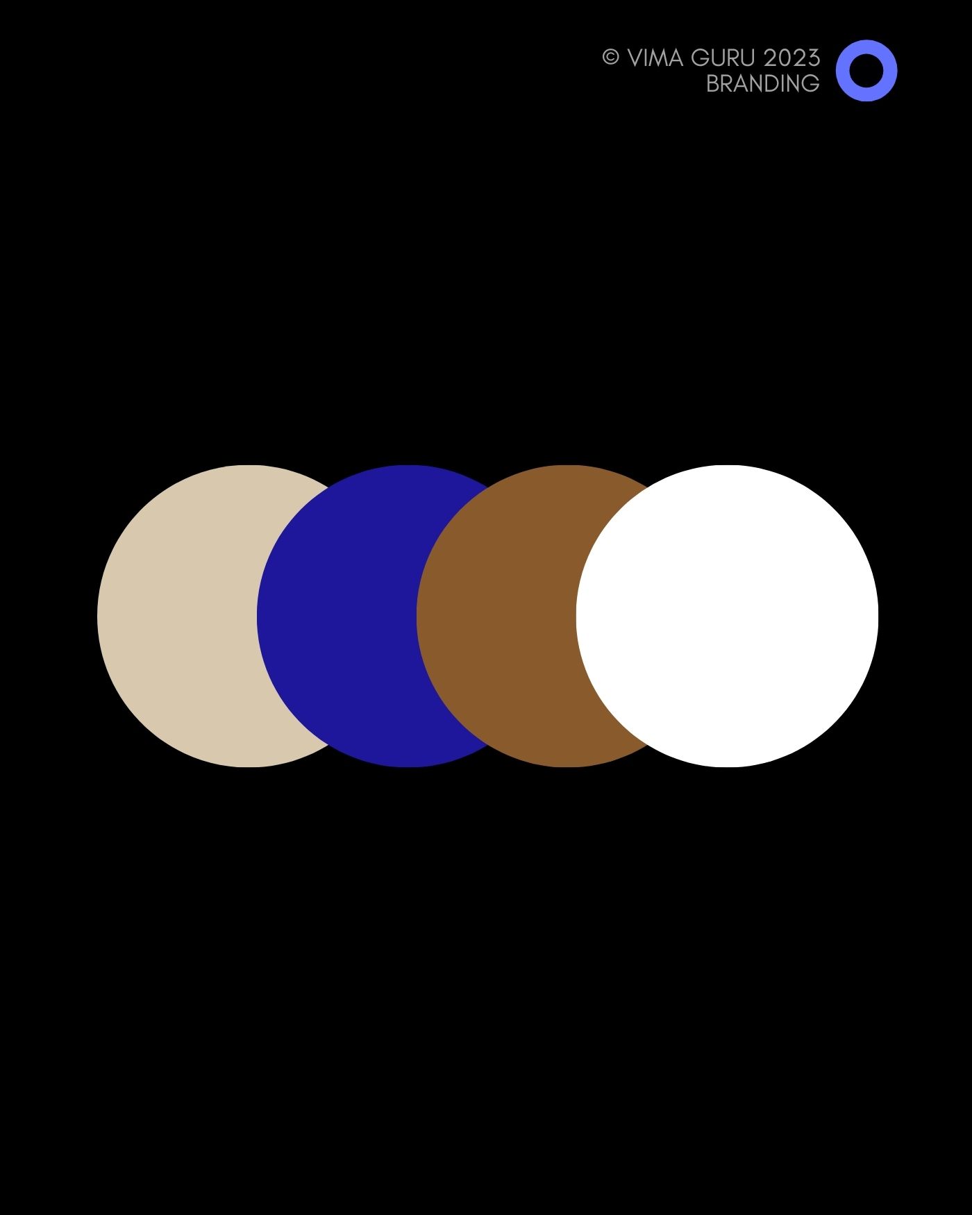
colours: a deep blue at the core, with warm brown, sand and white

02 The approach

Matter, made visible.

Three decisions shaped the identity: a concept drawn from the word itself, a palette that carries the founders’ character, and typography designed to outlast trends.

01

The concept: matter

The identity echoes the essential meaning of the word. The way matter occupies space on the canvas is partly irregular and open, just like the ideas that take shape during creation. The twin ‘tt’ motif becomes a unified symbol of Matter’s holistic approach to building.

Included

  • Brand concept and narrative
  • A logo built around the twin ‘tt’ motif
  • A standalone symbol for flexible use

02

The palette: bold and clear

Bold, clear shades express the integrity and dynamism that the three founders bring to every project: a deep blue at the core, balanced by warm brown, sand and white.

Included

  • Primary and secondary palette
  • Colour applications in print and on site

03

The typography: beyond trends

Typography is not just a vehicle for words but a pillar of the story the logo tells, designed to stand the test of time rather than follow trends. The identity carries the same weight on a business card, a site hoarding or a tote bag.

Included

  • Typographic system
  • Stationery and business cards
  • Site signage and branded merchandise

03 The work

From the logo to the building site.

The identity in use: symbol, palette, stationery, signage and branded objects, applied with the same restraint wherever the company appears.

The Matter Development wordmark in the signature blue
LogoThe wordmark in the signature blue
Matter Development business card on stone
StationeryBusiness card
The Matter Development twin tt symbol on a brown poster
SymbolThe twin ‘tt’ motif
Matter Development tote bag in the signature blue
MerchandiseA tote bag in the signature blue
The Matter Development colour palette
PaletteSand, blue, brown and white

Let’s talk

A development company
ready for its own identity?

Tell us about your company and the projects ahead. We will arrange a first conversation about the identity it needs and the market it addresses.

Scroll up