Aggelou Constructions | Rebranding
Established in 1963, Aggelou Constructions has long been synonymous with expertise in concrete, earning its reputation through decades of craftsmanship and commitment. Now led by the second generation of the Aggelou family, the company entrusted Vima Guru with redefining its identity while preserving its core legacy.
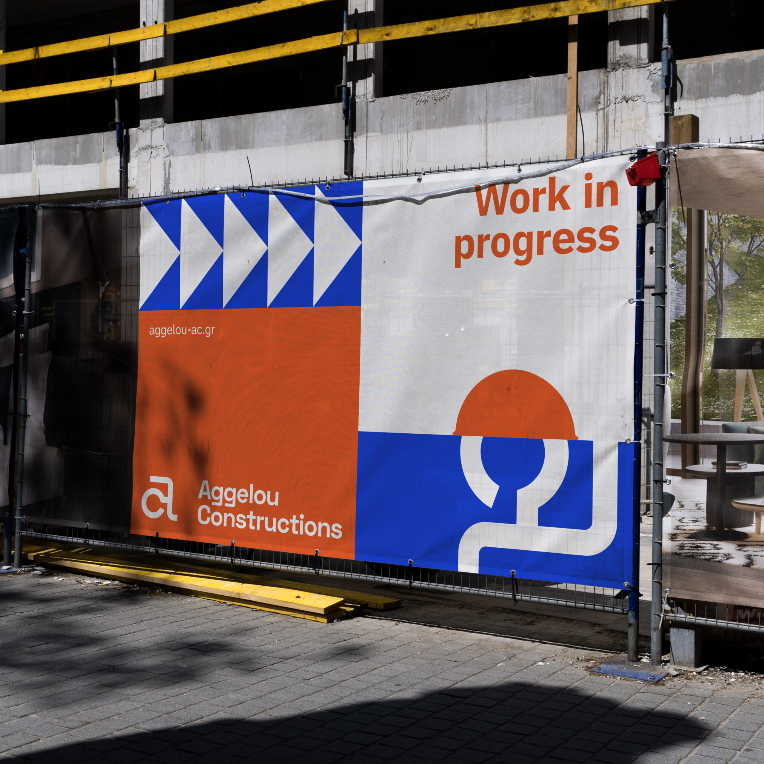
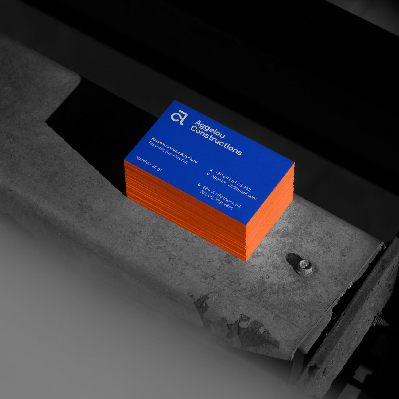
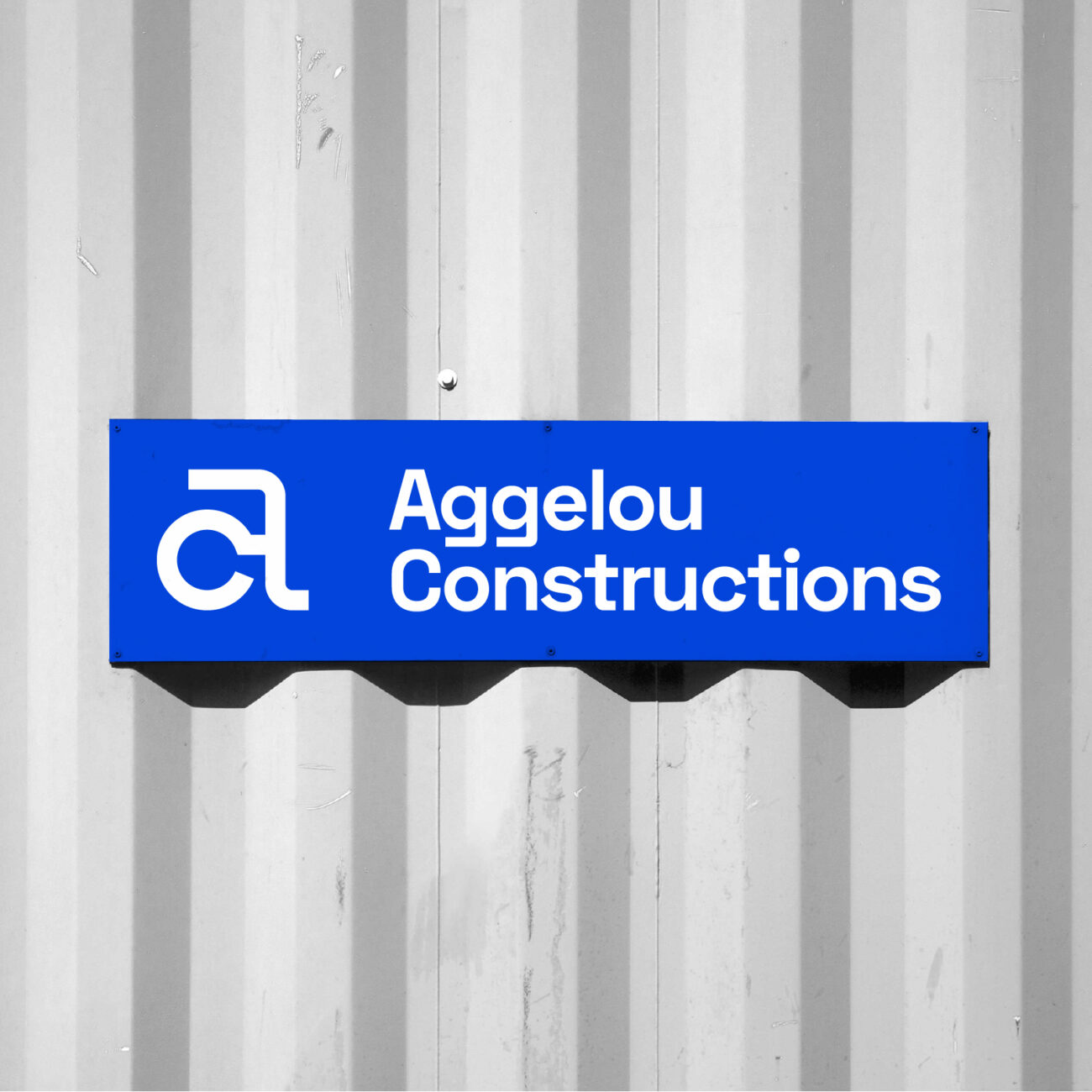
The rebranding centers on the evolution of their iconic “AC” symbol, embracing a modern yet timeless aesthetic that speaks to both continuity and innovation. The refreshed identity honors the company’s heritage, using bold geometry and a vibrant blue-and-orange palette to reflect its dynamic vision and expertise in durable structures.
This new visual language bridges the past with the future, symbolizing the strength and adaptability of the brand. It serves as a reminder that Aggelou Constructions continues to set the standard in concrete solutions, where legacy meets progress, and vision builds tomorrow.
Discover the essence of evolution through our portfolio of transformative branding projects.
Client: Aggelou Constructions


