Korinthian Foods | Branding

BRANDING · FOOD & BEVERAGE

Korinthian Foods

A brand identity built on a single idea: infinite quality and taste

01 The brief

One idea, carried everywhere.

Client
Korinthian Foods
Sector
Food & beverage
Scope
Brand identity: concept, logo and symbol, colour, stationery, signage
Tagline
“Infinite Quality & Taste”

Korinthian Foods is known for the consistency of its quality and taste. Its new identity had to express exactly that: a presence that feels established and contemporary, and is built to last.

At VIMA GURU, we built the identity around a single concept, infinity: endless, boundless and timeless. The brand’s tagline, “Infinite Quality & Taste”, became both our inspiration and our compass for every design decision.

The identity at a glance

Symbol

∞

the infinity mark at the heart of the logo, a promise of consistency

Colour

1

vivid, almost neon red, long established in food and instantly recognisable

Tagline

3

words that set the direction: Infinite Quality & Taste

02 The approach

Infinity, as a system rather than a symbol.

Three decisions shaped the identity: one concept, one colour and one consistent application across every touchpoint.

01

The concept: infinity

Infinity became the narrative that runs through the whole identity. Endless, boundless and timeless, it expresses the brand’s commitment to consistent quality and gives every element a reason to exist.

Included

  • Brand concept and narrative
  • A logo built around the infinity symbol
  • A standalone symbol for flexible use

02

The colour: a vivid red

We chose an almost neon red, a colour long established in food as stimulating and inviting. Fresh and contemporary yet timeless, it pairs with the infinity symbol to create a mark that holds attention and suggests permanence.

Included

  • A signature red at the core of the palette
  • Colour and symbol working as one recognisable mark

03

The application: every touchpoint

The identity was designed to carry the same weight wherever the brand appears, from printed materials to its presence in the built environment. The new Korinthian Foods offices, designed by Dezone Archi+, fully incorporate it.

Included

  • Stationery and printed materials
  • Signage and architectural presence
  • An identity integrated into the new offices

03 The work

From the logo to the building.

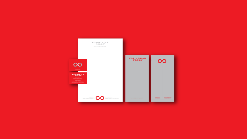
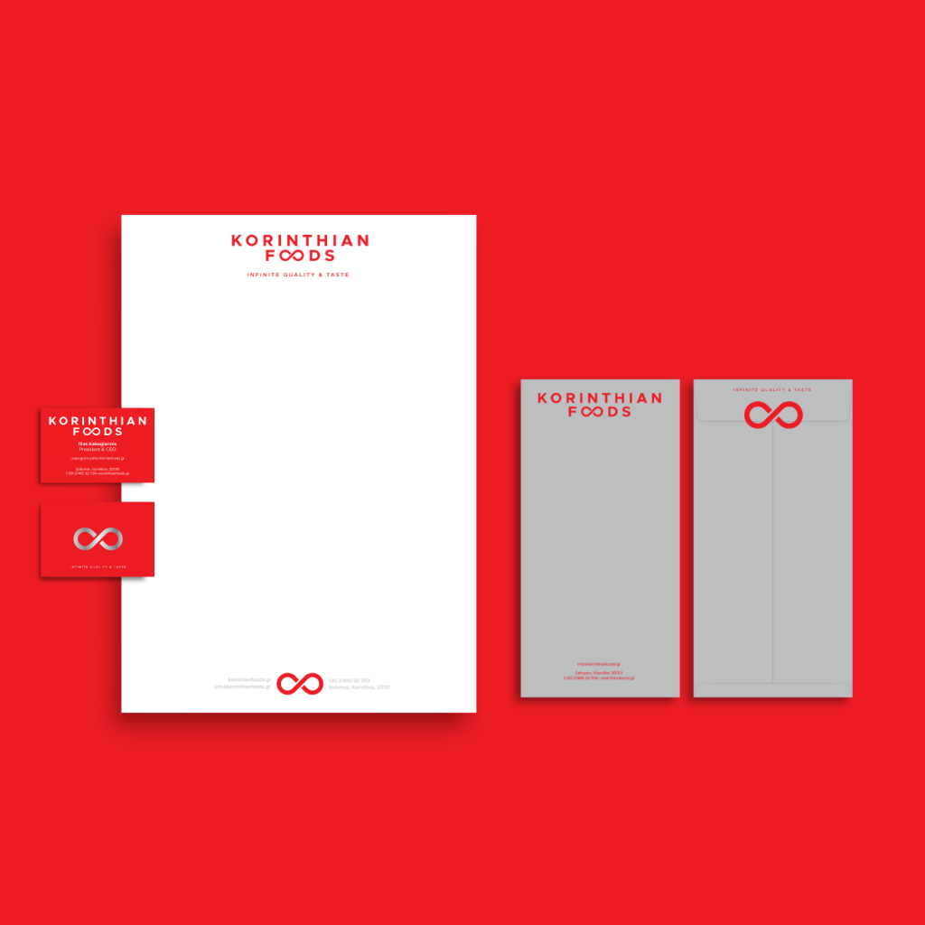
The identity in use: the logo and symbol, the stationery, the signage and the new offices, where the brand becomes part of the space.

Korinthian Foods stationery on the brand’s signature red
StationeryThe full set on the signature red
Korinthian Foods logo with the tagline Infinite Quality & Taste
LogoWith the tagline Infinite Quality & Taste
The Korinthian Foods infinity symbol in white on red
SymbolThe infinity mark
Korinthian Foods letterhead and business cards
PrintLetterhead and business cards
The new officesInterior design by Dezone Archi+, with the identity fully incorporated

Let’s talk

A brand to build
or renew?

Tell us about your business and where it stands today. We will arrange a first conversation about the identity it needs and the market it addresses.

Scroll up