Branding

Brand identity design,
with strategy
and character.

Every identity we design begins with an understanding of the business, its market and its audience. Strategy comes before design, and the logo becomes part of a complete visual and verbal system, designed for real-world use: from the website to construction-site signage or a hotel reception.

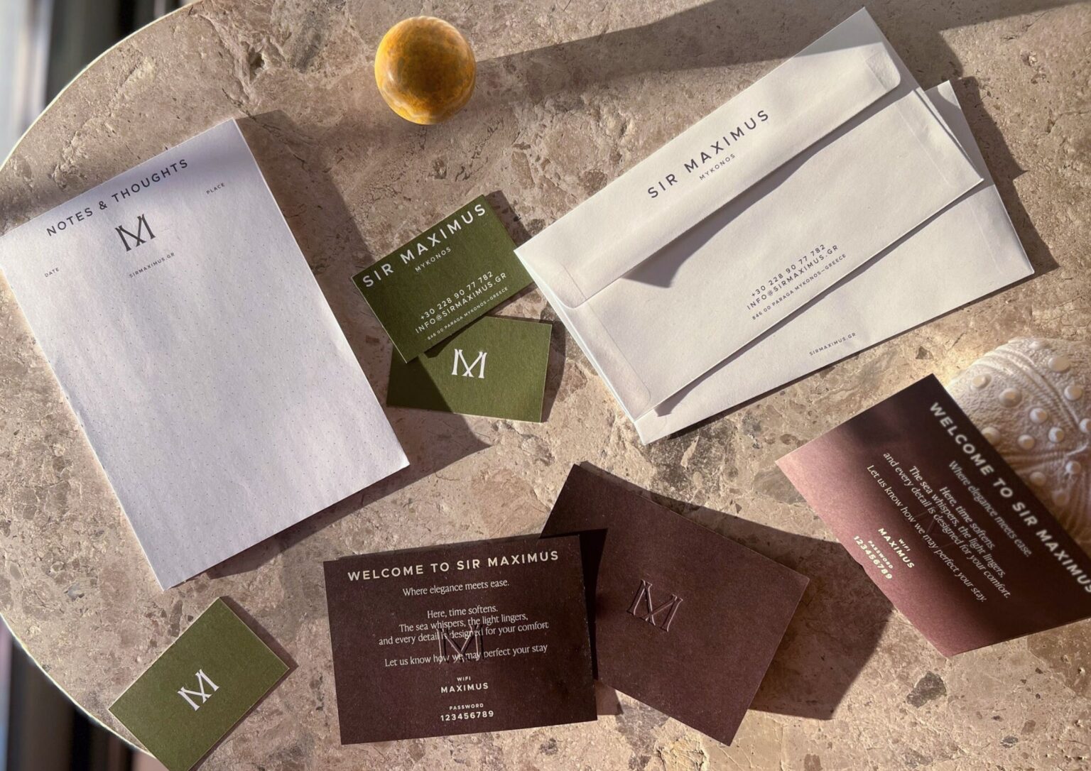
Letterheads, envelopes and business cards for Maximus Mykonos with the ‘M’ monogram, on a stone surface
ON THE COVERMaximus Mykonos 5*: stationery and business cards.Read the case

BRAND ACTIVATION

Identity at work.

We activate the new identity at every touchpoint, from the website, social media and advertising to print and signage, with the same team that designed it.

Example: Aggelou Constructions

01 THE IDEA

A logo is a mark.
An identity is a system.

A corporate identity is the set of elements through which a business becomes recognisable: its name, symbol, typography, colours, visual language, the way it writes and communicates, and how all of these are applied. Designed separately, these elements fragment the image of the business. Designed as a system, they share a common logic.

A well-designed identity expresses the character of a business and the position it seeks in its market. It sets the business apart from its competitors and, applied consistently, strengthens its recognition and helps build relationships of trust with its audience.

For a growing business, with new projects, products or markets, the identity also works as an organising tool: a shared framework for every new application. That is why every project starts with three questions: who the business is, who it speaks to, and what sets it apart.


Construction site sign for Kanavos Constructions with the yellow ‘K’ symbol
FIG.Kanavos Constructions: the identity applied to site signage.

02 WORK

Selected brand identity projects.

Five projects that show how we work: three new brands and two rebranding projects, across hospitality, real estate development and construction. Each began somewhere different: a hotel not yet completed, the meaning of a word, the history of two family businesses, a name that had to be created.

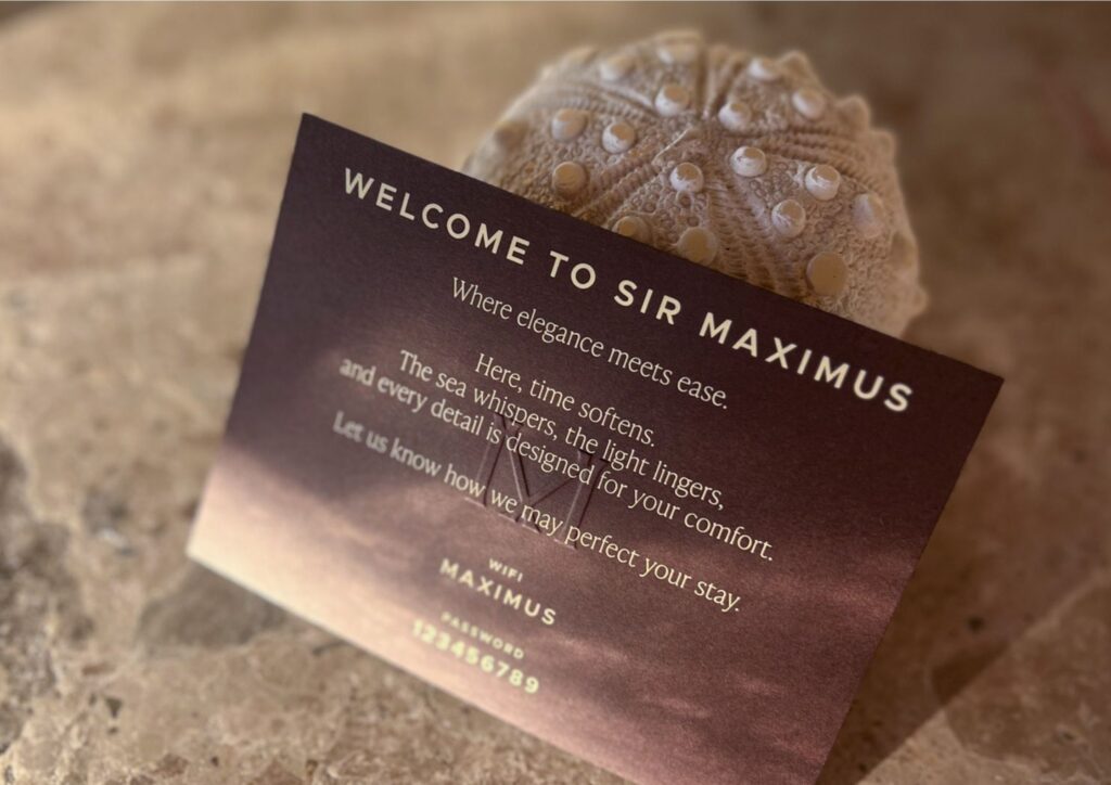
Welcome card reading ‘Welcome to Sir Maximus’, on stone
Welcome card, under the hotel’s original name, Sir Maximus.
The ‘M’ monogram of Maximus Mykonos in cream on dark brown

01Maximus Mykonos 5*5* hotel · Mykonos

A hotel brand, built before the hotel.

A complete identity for a five-star boutique hotel, designed before the hotel was completed. The ‘M’ monogram, colour palette and typography connect the stationery and welcome card with the website, which first presented the hotel through architectural renderings.

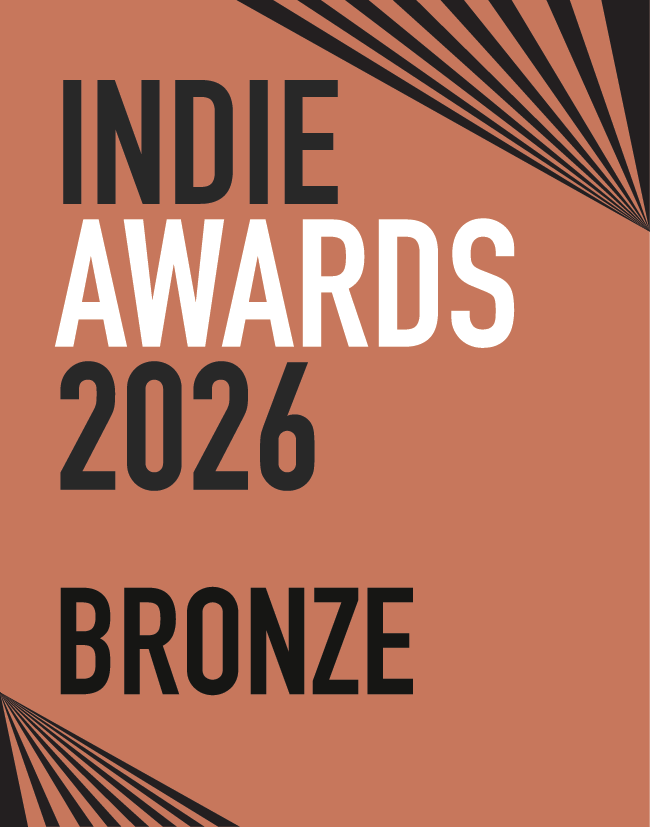
Bronze in the Websites category · Indie Awards 2026

Brand identity · Website · Copywriting

The Maximus Mykonos identity
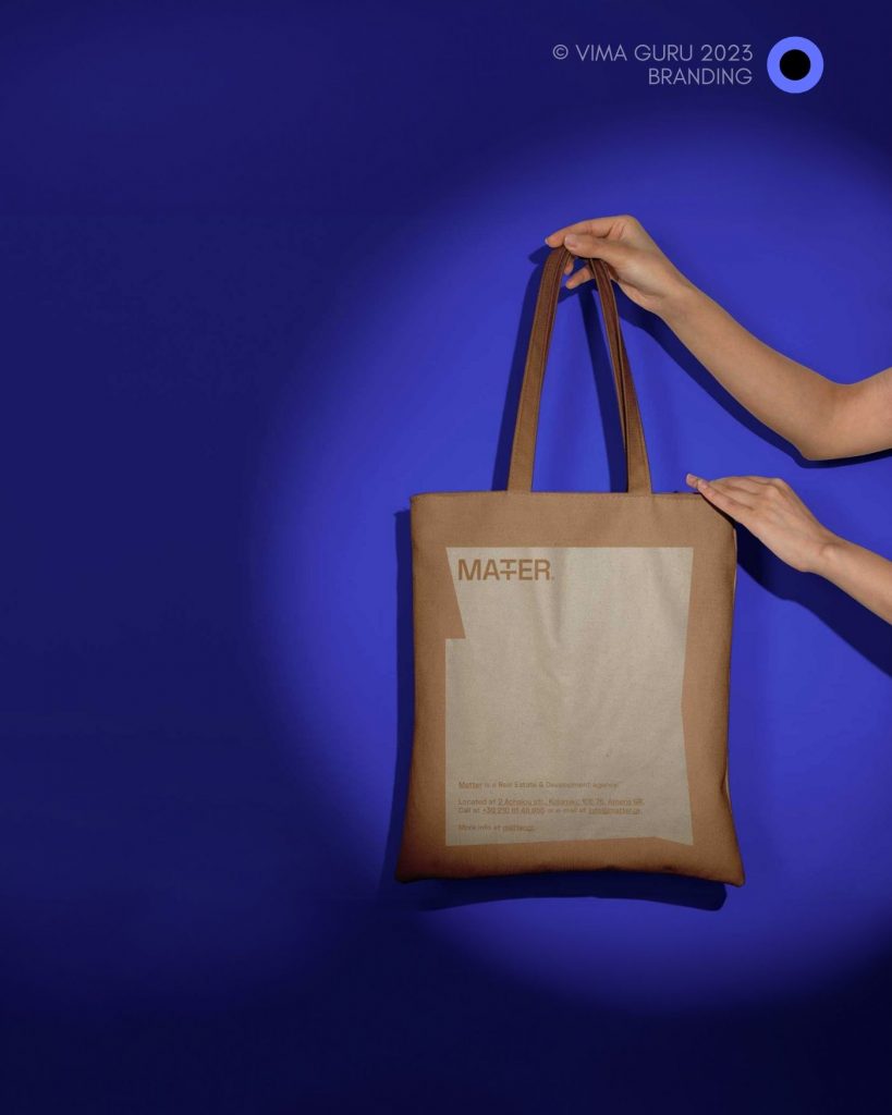
Hands holding a canvas tote bag with the Matter Development logo, on a deep blue background
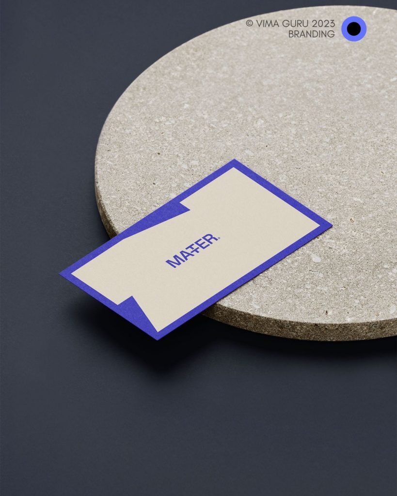
Brand identity applications: tote bag and business card.
Matter Development business card on a round stone base

02Matter DevelopmentReal estate development

Two ‘T’s, one structural element.

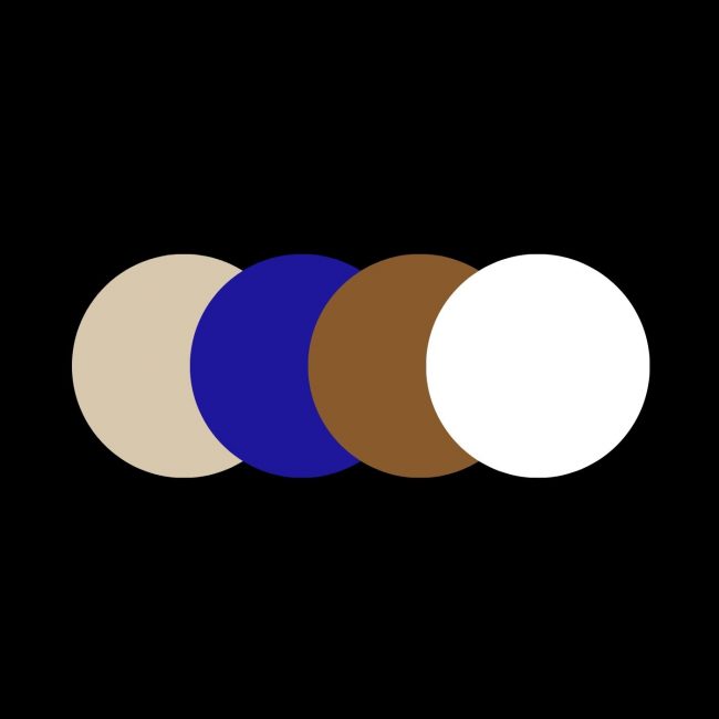
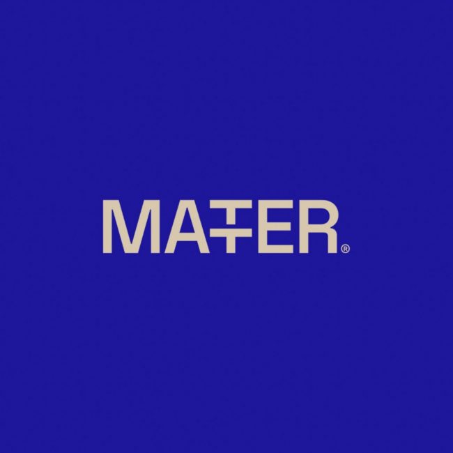
An identity for a real estate development company, rooted in the meaning of its name: matter. In the logotype, the two ‘T’s merge into a single letter with a double crossbar, a nod to the company’s role in shaping the urban landscape. Deep blue and earthy tones complete the system.

Brand identity · Creative design

The Matter Development identity

REBRANDING

“A rebranding never starts from zero. It starts with what deserves to be kept and looks for the form that suits it today.”

Several of the identities we have designed belong to businesses with a long history, like the two family-owned construction companies that follow.

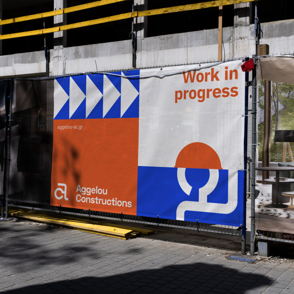
Scaffolding banner reading ‘Work in progress’ with the Aggelou Constructions logo
Construction site signage with the new corporate identity.
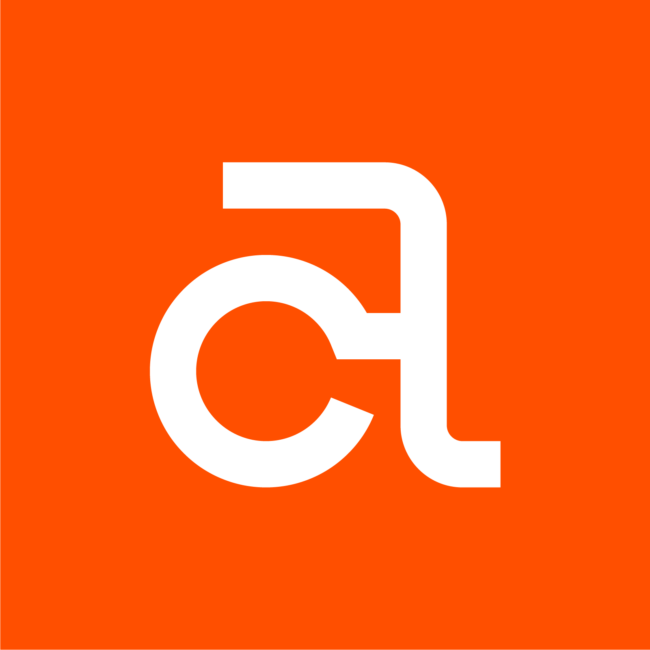
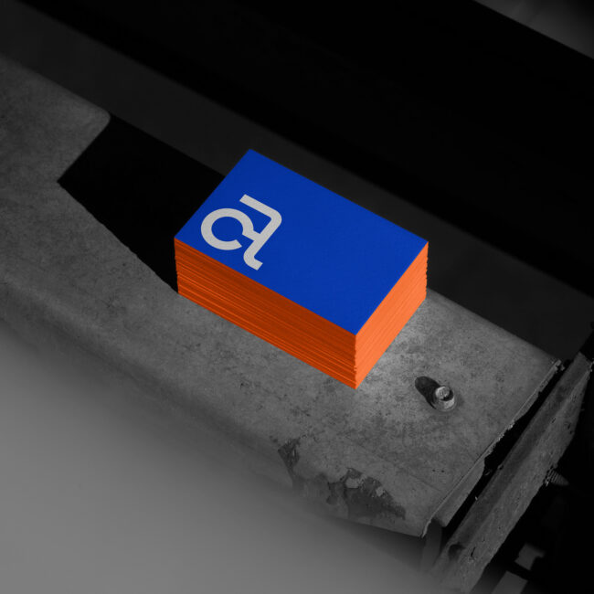
The ‘AC’ symbol of Aggelou Constructions, white on orange

03Aggelou ConstructionsConstruction · Corinth

A historic symbol, a new system.

A complete brand activation for a family-owned construction company specialising in concrete and active since 1963. The historic ‘AC’ symbol is retained and enriched with contemporary elements, within a blue-and-orange system applied to stationery, site signage and the new website.

Rebranding · Brand identity · Website

The new Aggelou Constructions identity
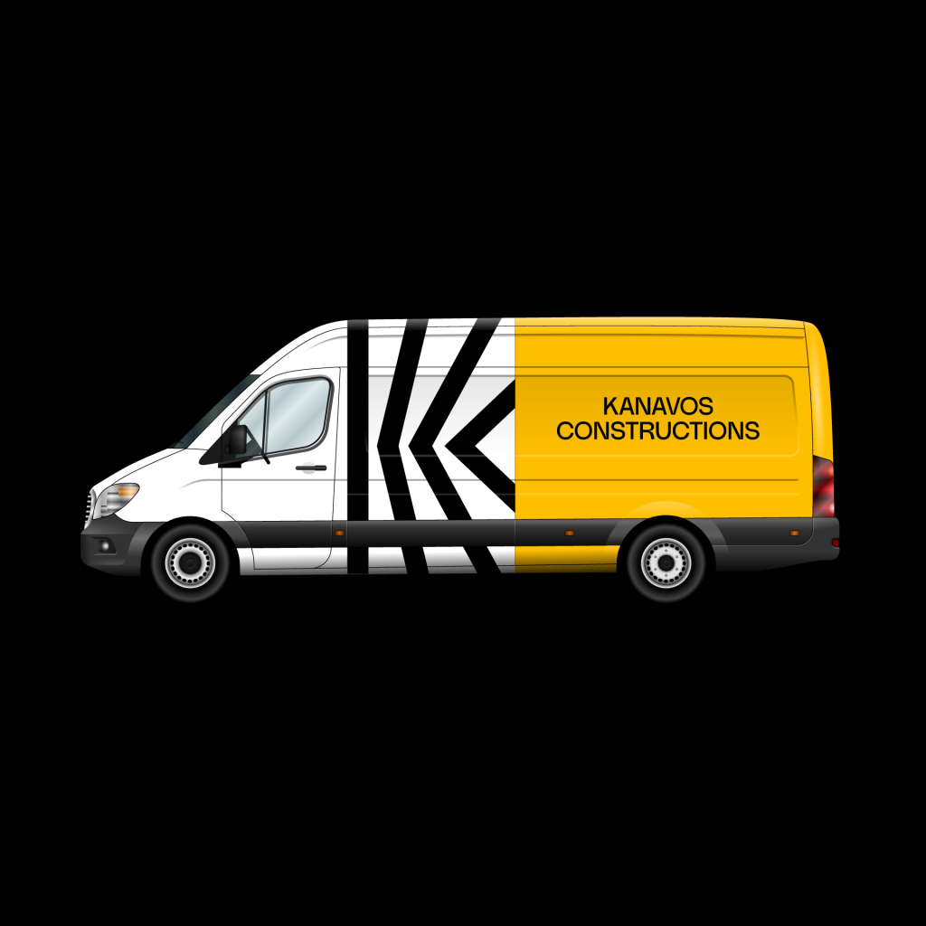
Company van with Kanavos Constructions graphics in black, white and yellow
The corporate identity applied to a company vehicle.
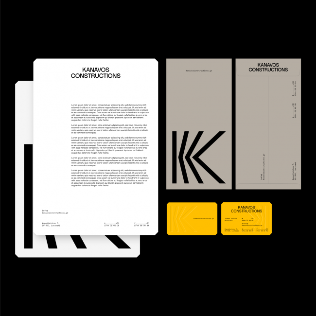
Letterheads, envelopes and business cards for Kanavos Constructions

04Kanavos ConstructionsConstruction

One ‘K’ in three phases, for three generations.

The new logo develops the ‘K’ in three successive phases, one for each generation of the family; read from left to right, it traces the path of materials towards construction. Around it, a single black-and-yellow system for stationery, vehicles, site signage and the website.

Rebranding · Website · Digital Performance

The Kanavos Constructions rebranding
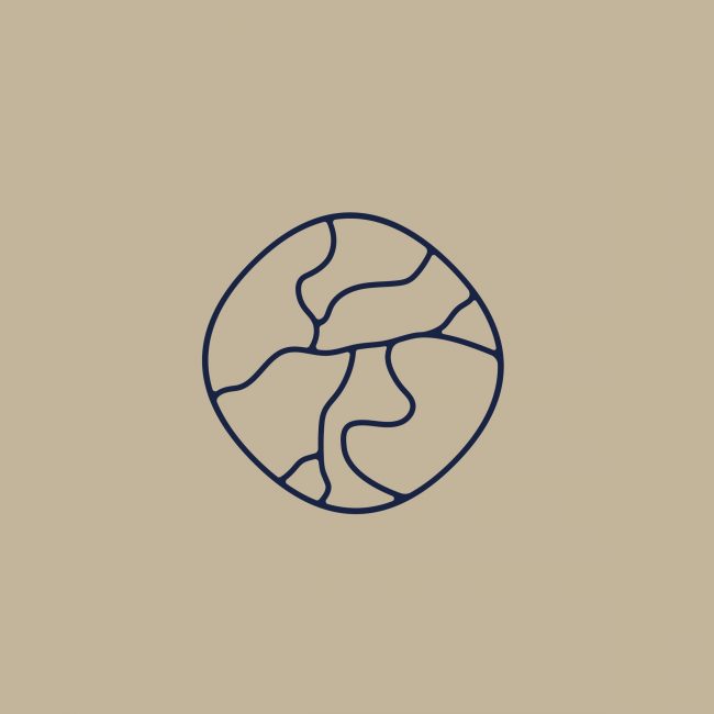
The Hama Seaside Luxury Apartments logo with its circular symbol, on a sand-coloured background
Logo, colour palette and stationery.
Hama Seaside stationery on a dark blue background

05Hama SeasideHospitality · Corinth

The cracks of kintsugi, the movement of the wave.

Naming, concept and brand identity for luxury seaside apartments in Corinth. The symbol draws the cracks of a kintsugi repair in fluid lines that also evoke the movement of the waves. The airy, fine typography follows Japanese restraint, and the palette moves between deep blue and the colour of sand.

Naming · Concept · Brand identity · Website

The Hama Seaside identity
Five of the 10+ brand identities we have designed. All brand identity projects

03 THE SYSTEM

What a brand identity includes.

A complete system, not a set of standalone files. Strategy, logo, visual identity and brand guidelines form the core of every project; naming, verbal identity and the range of applications are defined by the needs of the business.

  1. 01

    Brand strategy

    Strategic positioning, values, personality and core message: the framework that guides future decisions on communication and the development of the brand.

    POSITIONING
    VALUES
    PERSONALITY

    The Hama Seaside symbol as a line drawing
  2. 02

    Naming & tagline

    For new brands, or when a name needs rethinking: names and lines that express the strategy and are easy to say, write and recognise. For Korinthian Foods, the tagline ‘Infinite Quality & Taste’ gave the identity its central idea, the infinity symbol.

    NAME
    TAGLINE
    AS NEEDED

    Korinthian Foods logo and tagline on red
  3. 03

    Logo & symbol

    Design of the logo, symbol or monogram, with every version its use requires: from a building façade to the icon of a social media account.

    LOGO
    SYMBOL
    VERSIONS

    The ‘K’ symbol of Kanavos Constructions on yellow
  4. 04

    Visual identity

    Colour palette, typography, patterns, illustration and photographic style: the visual language that makes a business recognisable even when the logo is not in view.

    COLOUR
    TYPOGRAPHY
    PHOTOGRAPHIC STYLE

    The Matter Development colour palette in four circles
  5. 05

    Tone & copy

    Tone of voice, brand narrative and key messages, so that the business keeps a consistent, recognisable tone, adapted to the demands of each channel, in Greek and in English.

    TONE OF VOICE
    BRAND NARRATIVE
    AS NEEDED

    Matter Development sign reading ‘This is a work in progress’
  6. 06

    Brand guidelines & applications

    The brand guidelines, which set the rules for using every element, and the applications each project needs: stationery, signage, packaging, digital templates or social media content.

    GUIDELINES
    PRINT · SIGNAGE
    PACKAGING

    Aggelou Constructions business cards

04 THE METHOD

From substance to form.

Brand identity design begins long before the first sketch. Four stages, with clear deliverables and interim presentations, so that every decision is made together with you.

  1. 01

    Research

    Meetings with your leadership and team, analysis of the market and the competition, mapping of the audience and the business objectives. For a rebranding, we also assess the existing identity and what in it deserves to be kept.

  2. 02

    Strategy

    Strategic positioning, values, personality and core message. The framework is approved before design begins and becomes the benchmark for every creative proposal.

  3. 03

    Design

    Creative directions, development of the chosen proposal and testing in real applications, before it is finalised.

  4. 04

    Rollout

    Brand guidelines, files for every use and the first applications, for the launch of the new identity or a gradual transition from the previous one.

06 QUESTIONS

Frequently asked questions about brand identity.

Short answers to the questions we hear most often before a project begins. For anything else, our team is happy to help.

  • Brand identity design includes the brand strategy, logo and symbol design, the visual identity (colours, typography, patterns, photographic style) and the brand guidelines, the rules for applying it. Depending on the project, it can also include naming, tone of voice and applications such as stationery, signage, packaging and digital templates. The scope is defined at the outset, based on the needs of the business.

  • A logo is a business’s primary mark of recognition. A brand identity is the system it operates within: colours, typography, visual language, verbal communication and rules of use. Without that system, the same logo is applied differently every time and the image of the business loses its coherence.

  • When its image no longer reflects what it is or what it aims to be: after growth or a change of activity, during the transition to the next generation, before entering new markets, or when the existing identity does not work in digital media. A rebranding does not necessarily mean a new logo. It starts by assessing the existing identity and keeps whatever still has value, as with Aggelou Constructions, where the historic ‘AC’ symbol was retained and evolved.

  • Yes. For new businesses, hospitality properties or real estate developments, naming is often the first step of the identity. The name is developed together with the strategy and the creative idea, so that name, symbol and communication share a common starting point, as in the case of Hama Seaside.

  • It depends on the scope of the project: a new identity with naming takes longer than refreshing an existing logo, and the number of applications also affects the timeline. At our first meeting we agree the stages, deliverables and interim presentations with you, so that the timeline is clear from the start.

  • Yes. We have designed identities for hotels and holiday residences in Mykonos, Milos and Corinth, for real estate development companies and for construction companies. In the same sectors we also handle digital marketing, through our hospitality and real estate marketing services. We also design identities for businesses in other sectors, such as food and automotive.

LET’S TALK

Every identity begins
with a conversation.

Whether you are launching a new business or redefining the presence of an established one, our first meeting is about your business: its goals, its audience and the position you aim for in the market.

Scroll up